

Build a CPPW speed line
In this path, you will build a real visualization: CPPW speed throughout the day.
Pregunta real de plantaReal plant question
How did CPPW speed change throughout the day?
- FuenteSource
- TiempoTime
- MétricaMetric
- RangoRange
Before you begin
You need permission to:
- view
robotic.sensor_data; - create charts;
- save content, if you want to keep the result.
If the source is missing, do not choose a similar name. Ask for access to the correct source.
1. Choose the source and line chart
- Open Charts.
- Click + Chart.
- Search for
sensor_dataunder Data source. - Select Line chart.
- Click Create new chart.
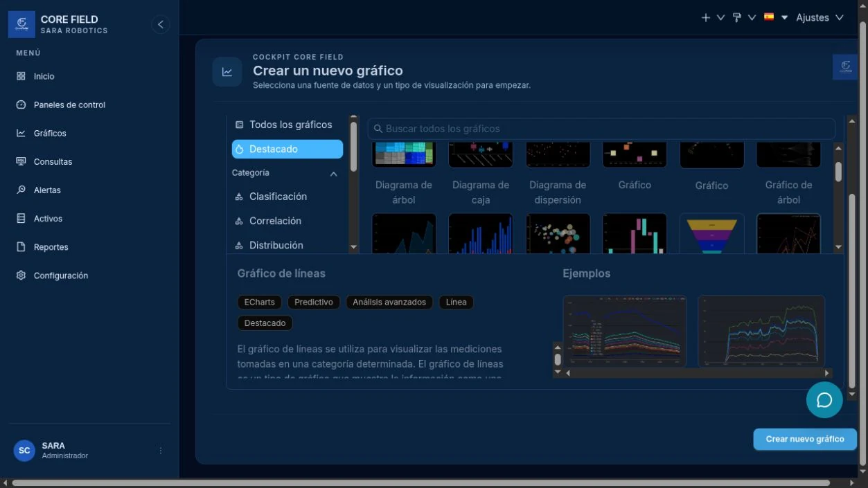
2. Recognize Explore
Explore has three areas:
- Source, on the left: available columns and metrics.
- Configuration, in the center: time, metric, filters, and appearance.
- Preview, on the right: the query result.
The preview does not change after every edit. Click Create chart or Update chart.
3. Complete the four controls
| Control | Value in this example | What it does |
|---|---|---|
| X axis / Time column | timestamp | Places each reading in time. |
| Time grain | Minute | Groups readings so the curve stays readable. |
| Metric | CPPW | Selects the sensor value to measure. |
| Time range | Today | Limits the query to the current day. |
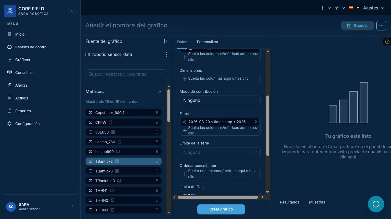
4. Run and wait
- Confirm no required field has a red mark.
- Click Create chart.
- Wait for the button to change to Update chart.
- Do not save while the screen says Loading.
5. Validate the result
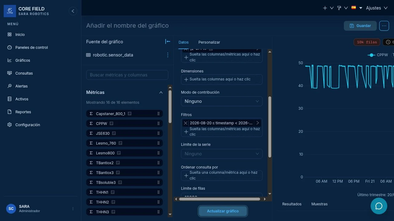
Check three things:
- Processed rows exist. The count confirms the query returned data.
- The line is visible. No empty area or loading state remains.
- The axis is correct. Hours match the range you selected.
Resultado esperadoExpected result
CPPW appears as a continuous or segmented line, the row count is visible, and the horizontal axis matches today.
If the curve has too many points
- Change the time grain from Minute to Hour.
- Or reduce the time range.
- Update again and compare readability, not only speed.